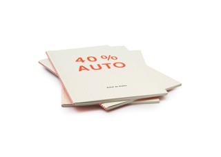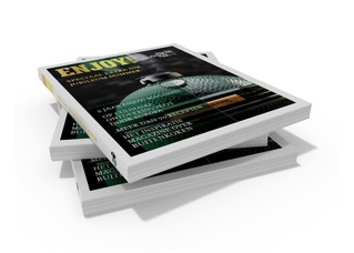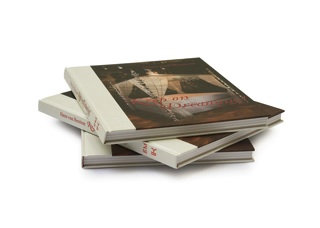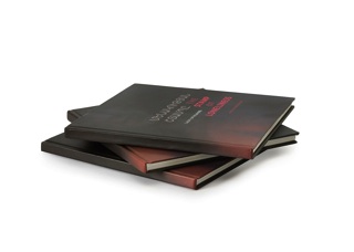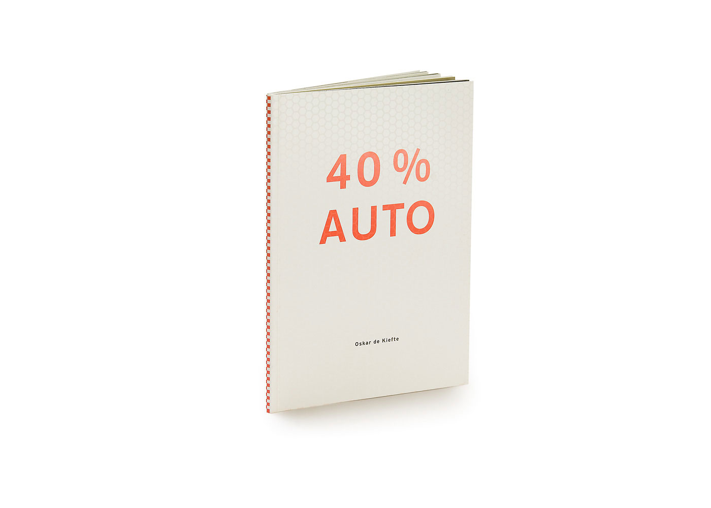
40% AUTO
Collaboration with the artist. The design of the catalogue is loosely based on the design of a typical mail order catalogue. With no clear beginning or ending...
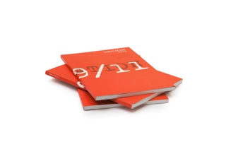
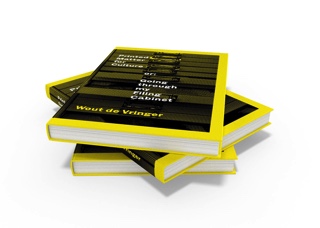
The design of the cover tries to capture the appearance of a traffic sign. We even tried to imitate the reflecting coating which is used on real traffic signs... And the traffic sign is referring to the title: 40% Auto (Auto is dutch for Car/Automobile). Even the typeface, 'Interstate', is referring to the title of the catalogue... (Interstate=Highway>Cars... etc)
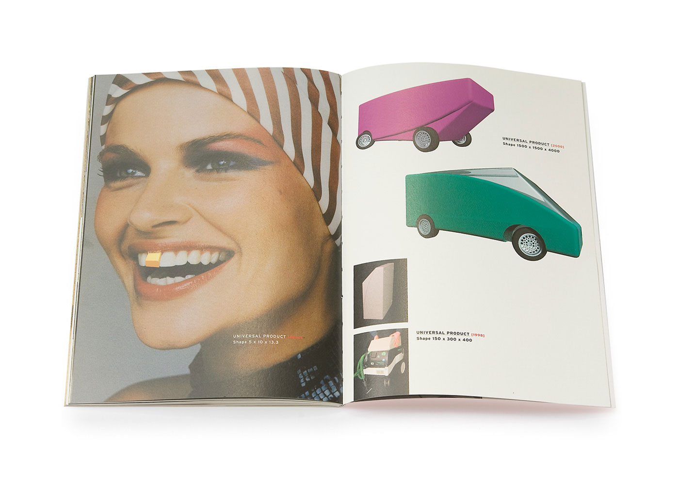
To explain the title '40% Auto' is very simple: 40% of the projects shown in the catalogue involve cars!
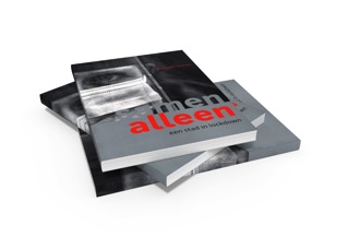
title 40% AUTO
client Centrum Beeldende Kunst Provincie Utrecht
publisher Centrum Beeldende Kunst Provincie Utrecht
editor Oskar de Kiefte, Wout de Vringer
book concept Oskar de Kiefte, Wout de Vringer
book design Wout de Vringer
font Interstate
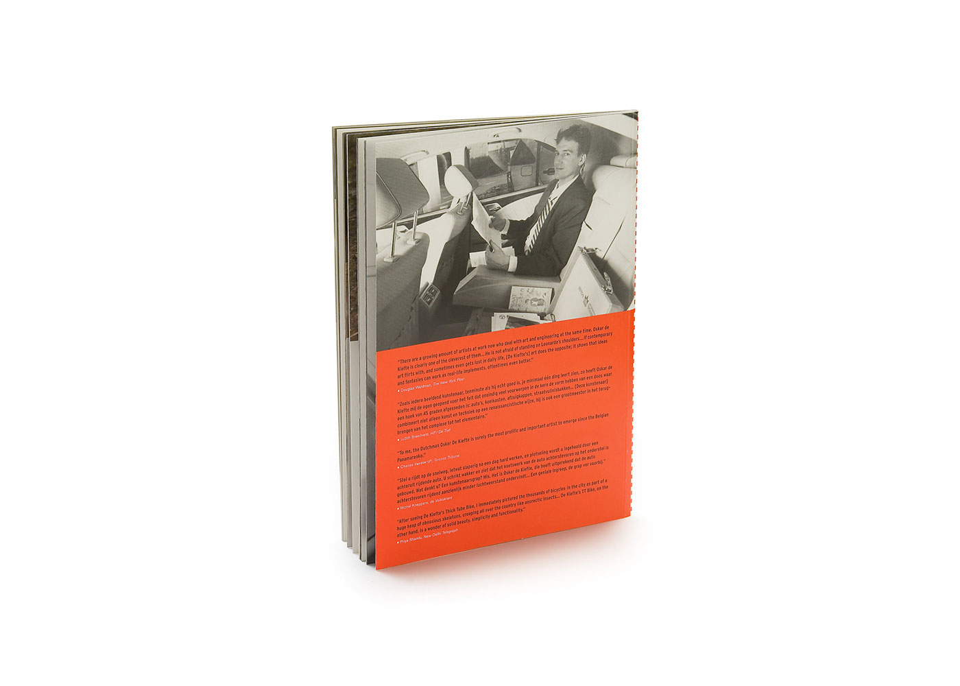
size 170 x 240 mm
pages 44
printing full colour offset
cover paperback, printed in a custom made glossy varnish with metallic silver incorporated
published 2000
isbn 90-74690-27-0